

Based on user feedback, I rearranged the badge placement on the homepage. The feedback I received was that in the original placement, it was a bit cramped, hard to see, and made it feel like there was too much going on in the hero section.
Moving the badge out of the hero section helped with visual hierarchy to draw more focus to the headline and CTA. Placing the badge in its own thin section under the "Browse Products" also helped to draw attention to the badge without being crowded by other elements.

After reviewing some insurance websites, I noticed they usually had a "Save for Later" type option. I added this to my form as I felt like would help to make a better user experience, especially if someone couldn't finish filling out the form at the moment.

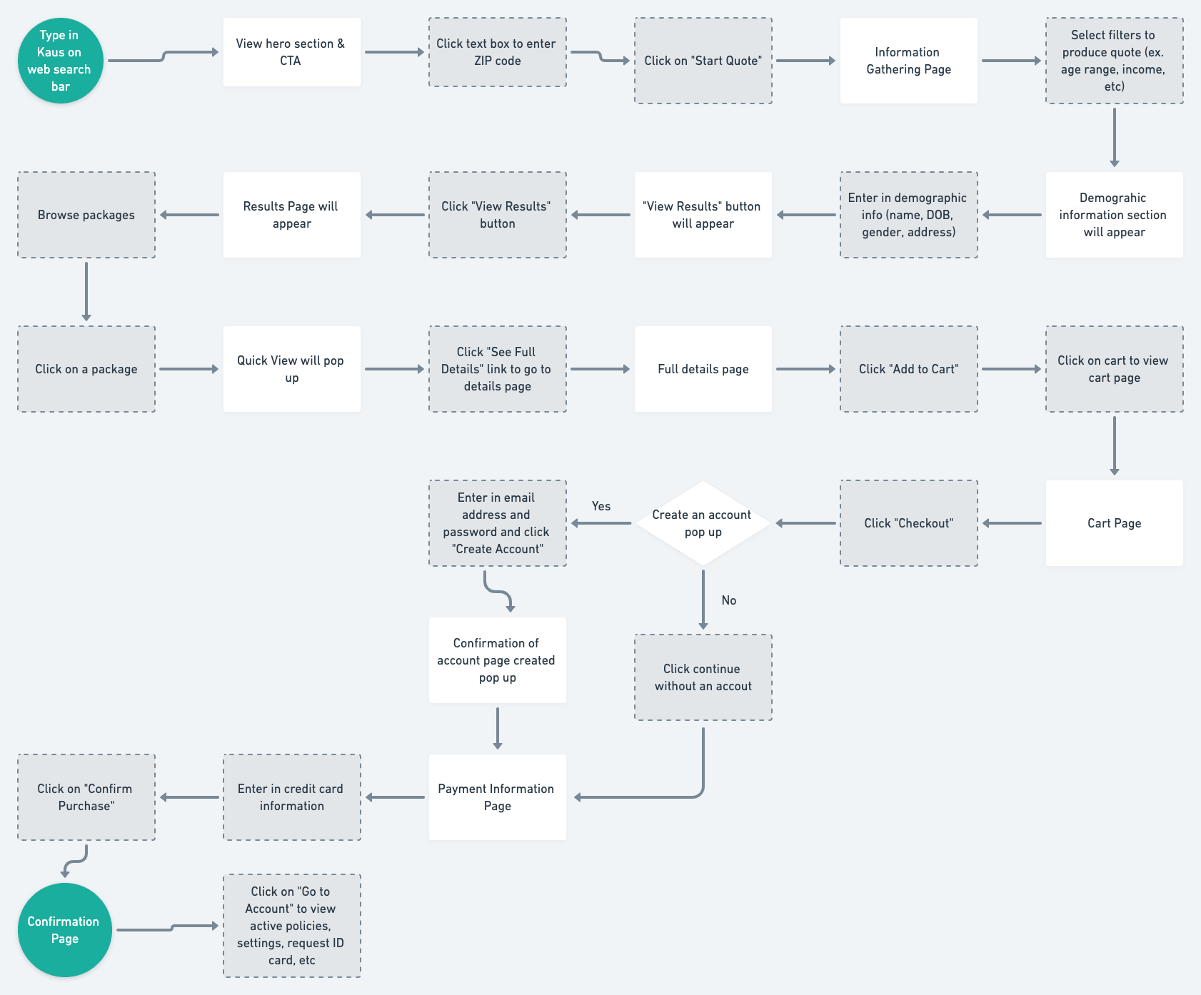
I received feedback to add some more information to the confirmation page in regards to the user's ID card. This would let the users know they would be receiving a physical ID card but could also retrieve it in their confirmation email or on their account. This would also incline the user to browse their account page on Kaus and potentially look at other insurance types.
